JADE Ceramic
Built Entirely from Scratch
Static & Dynamic Graphics
International Reach
JADE has been such a large part of my career which is why I’ve chosen to do a featured case-study. I think it deserves its own section outside of the B&B portfolio because in many ways it stands on its own and also is a prime example of the process I go through with many B&B clients.
I’m honored that a brand I started from absolutely nothing has grown to what it is today. I’m humbled that I’ve let the brand go and happy to still see it flourishing with all of my design languages still being respected.
From concept to reality
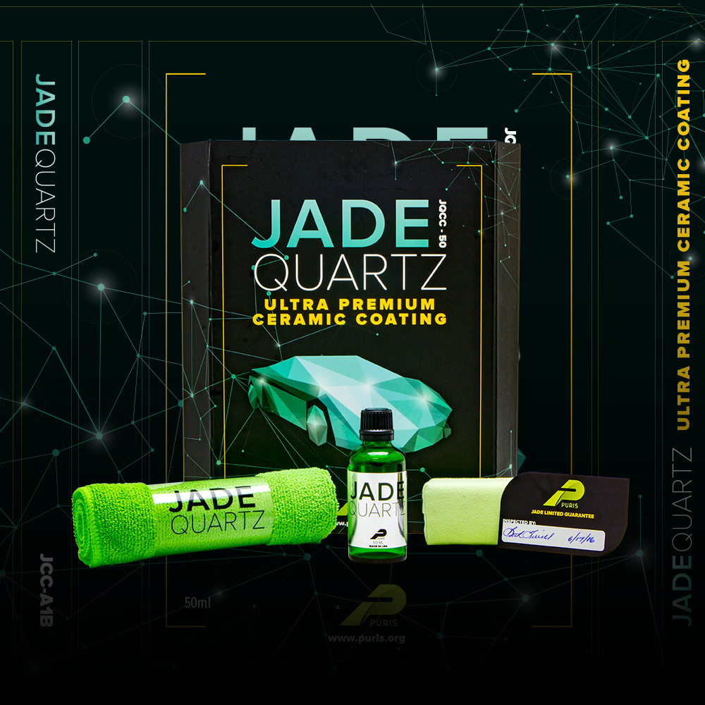
JADE was originally the product name for B&B’s entry into the world of ceramic coatings. I was tasked to design all the packaging in a very compressed amount of time. B&B wanted the product to look “ultra premium” and on the market as soon as possible. I developed everything in a very timely manner, used a basic font to convey the brand and before we knew it, a fully fleshed out kit was ready to ship in the hundreds.
Logo Design
Started as a simple font and workshopped with the sales team and the board into what it is today
General Optics
The logo became the cornerstone and driving factor in how the brand was perceived but with the need of versatility JADE was has two languages: a dark and a light motif
Labels
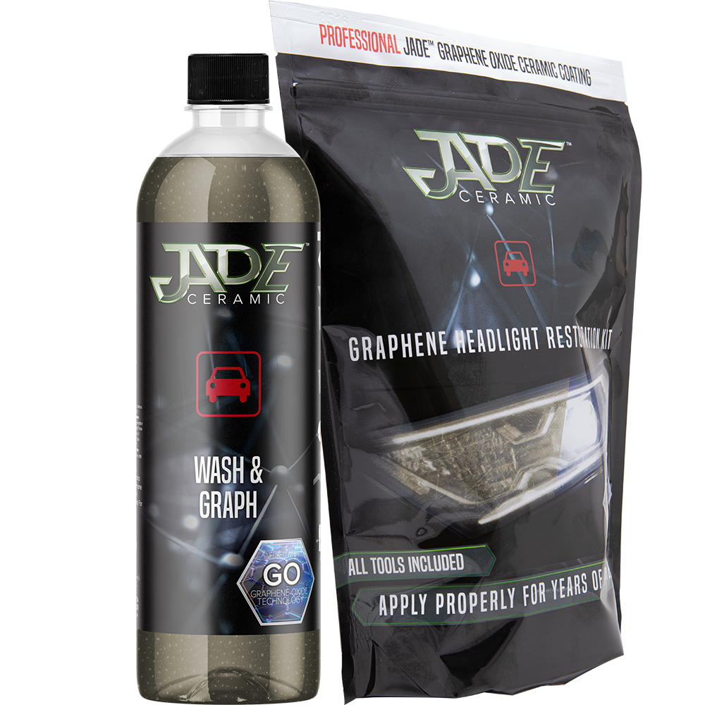
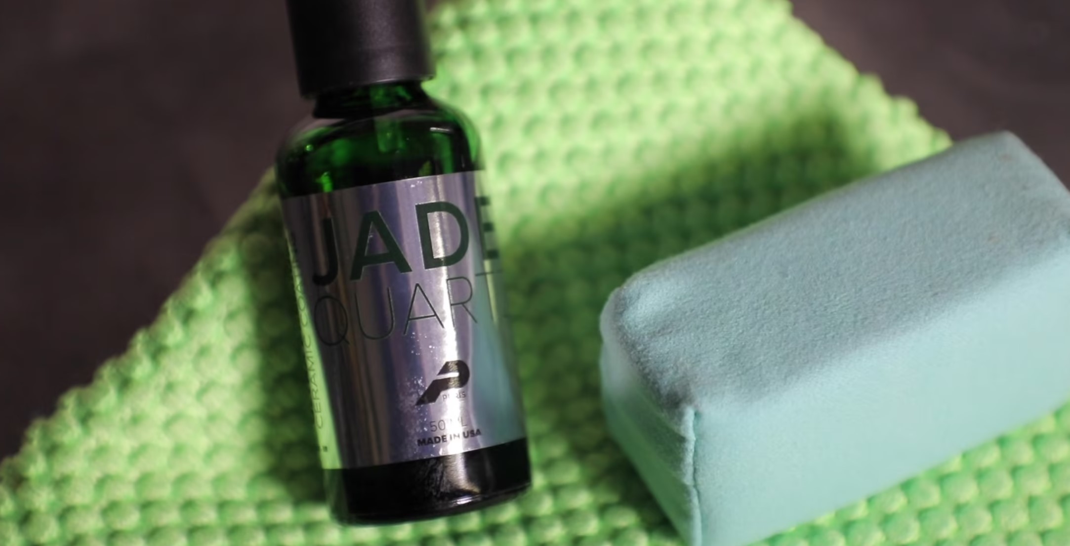
JADE labeling utilized the latest in print technology. Matte laminate, with spot-UV, spot reflective areas, custom die-lines, and proudly is always OSHA compliant
Marketing Material
I single-handedly created every piece of printed and non-printed material. This ranged from pamphlets, distributor guides, to entire tradeshow booths. JADE has exhibited as separate entity from B&B at SEMA and Automechanika multiple years
Simply a Text Tag
JADE ceramic coating was a huge hit, not only was it one of the only US made coatings but the chemistry was second to none and we decided to build on the success by introducing a new line of PURIS products that bare the name. The JADE-tagged products would signify an even more premium product with higher amounts of active chemistry in an already premium car care line.
JADE became synonymous with “B&B’s best stuff”. Anything associated with JADE was selling extremely well, so well that customers that exclusively private-labeled would buy PURIS JADE products to put on the shelf next to their own product-line. At this point, JADE was just itching to break out of PURIS and become its own entity.
It was time to elevate JADE from a pedestrian font-only brand and give it some true identity.
Logo Design Process
I start by doodling either on my iPad or just dive right into Illustrator, either way I’m conceptualizing in vector so that the work is at maximum flexibility.
I start with basic shapes, keeping the golden ratio in mind, play with fonts, draw flourishes, and establish a sort of personal base-line before doing any research. I put the research second because I want my raw interpretation of my ideas before being influenced by outside factors. This sort of ensures originality and gives me a chance to compare unadulterated work to what’s already out there.
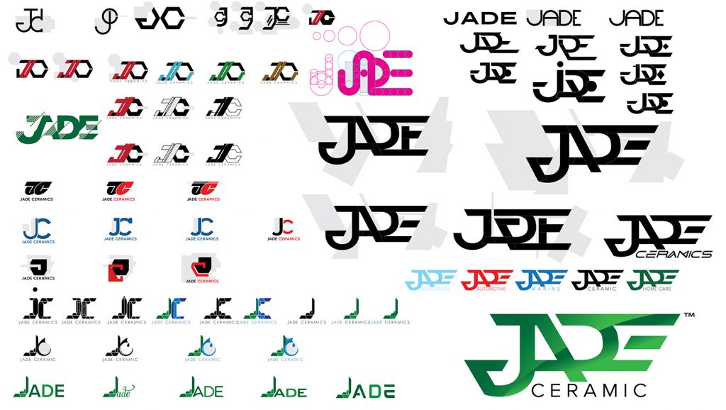
At first I tried to monogram it with just to letters but as I worked on “JC” just kept bringing images of theism so I scrapped the idea and started spelling out J-A-D-E.
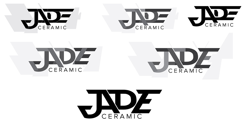
I was sure I didn’t want to use a font-text and really design a true logo so drew a lot of boxes and started to carve away to reveal letters (the grey patches is my way of carving). Eventually the logo started to reveal itself in the form of pilot wings (the badges they wear on their uniform) and since ceramic coatings are used in aerospace, I kept with the idea.
The lower-right (in the picture above) was the first iteration that would be presented to the team and the board.
Almost there
It was close but not quite there yet. My thought process was to create a logo where letters share the same anatomy. In this instance: bowls, counters, and strokes are shared between all the letters but most agreed that something was missing.
The concept was solid, it just needed to be fine-tuned.
I had decided that maybe the lettering was slightly too abstract (I have a history of very complicated urban writing so sometimes abstract text isn’t so abstract to me). I took the concept and tried to simplify it by closing the bowl in the ‘D’ by adding a counter and ‘lockup’ the design to be slightly more symmetric, I did this by extending the ‘E’.
This concept was met with high-praise and was overwhelmingly approved by all – this became the basic shape to the JADE logo we know today!
Next up was to give the logo a little flare, I created a few variations pertaining to different uses.
The variants and their uses
Flagship Logo
Used wherever possible without compromising the look.
Solid One-Color
For applications where simplicity is the target.
Color Duo-Tone
Light and dark variants for when duo-tone color is the only option.
Grayscale Duo-Tone
For when duo-tone is an option but no color is available.
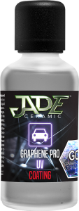
Graphene Tag
The coating world has shifted towards ceramics with graphene infused (SiO2) products and adding a simple tag seemed like the right choice.
Dark Background
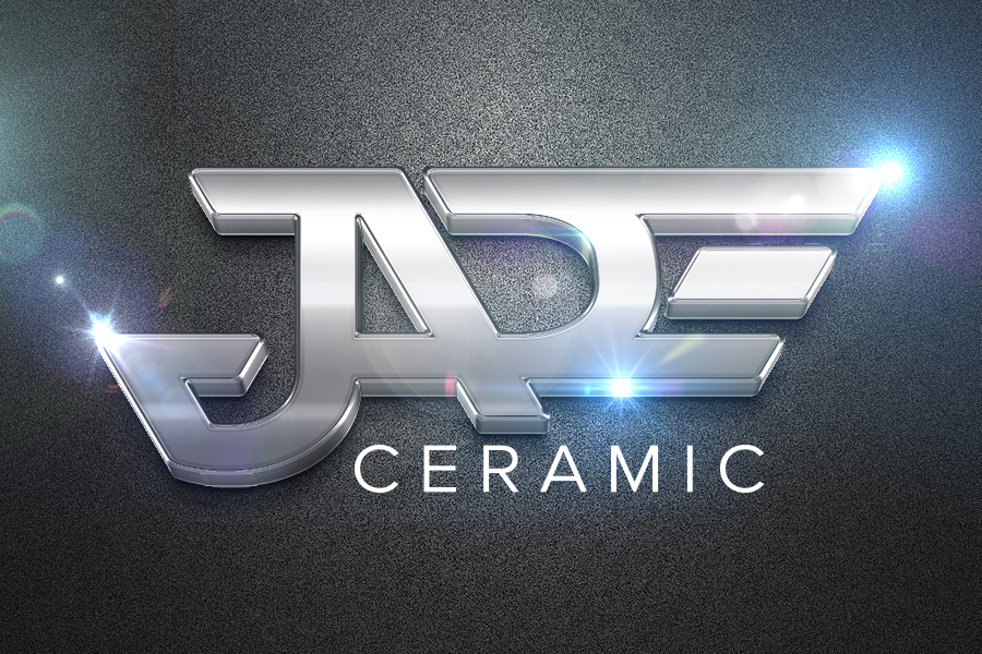
There have been a couple dark-themed backgrounds I’ve created as backdrops for the brand (varied depending on the product or application). The concept is based on the armor that ceramics becomes once cured complimented with the molecular structure of the chemistry. Stylized to be unobtrusive but unique
JADE Expansion
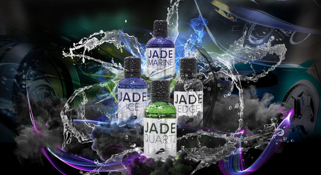
In my conceptual drawings there are many variants showing that the JADE brand itself was already in the works to expand beyond just ceramics. JADE has been poised to be in multiple industries since it broke off into its own brand. The first industry is MARINE with many others on the horizon. Rather than reinventing the wheel, the color scheme changed and the world “CERAMIC” was replaced.
JADE aerospace, home, and fabric have already begun but no fully official launch has been announced. JADE has already gone through NSF, Boeing, and SRS certifications to get a head start on staking a claim in non-automotive industries.
JADE Applied
Banners
Dozens of Shop Banner Designs
Hundreds Hang Around the Globe
Always in Hi-Res for Maximum Clarity
Supplemental
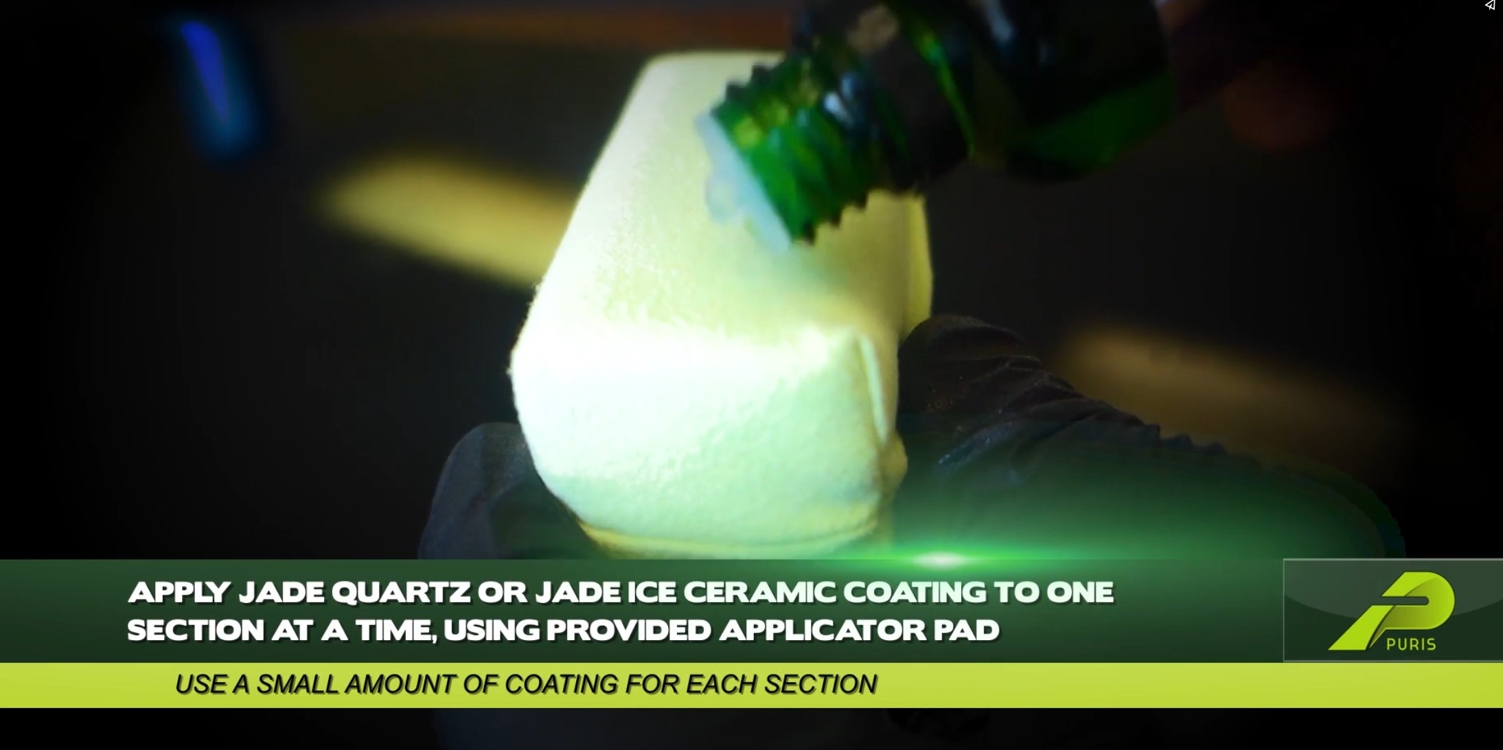
Installer tools

Labels
Nearly 200 Different Labels
Absolutely Compliant
Mass Production
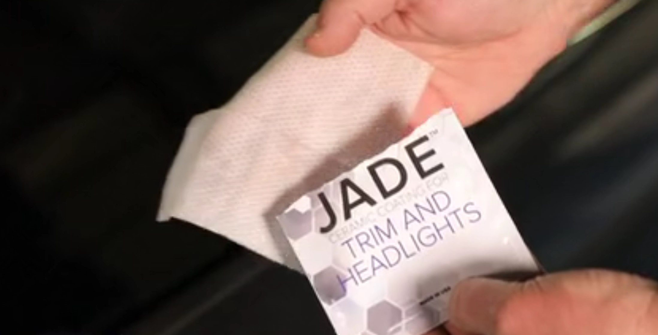
Alternate Light Motif
The lighter motif was designed for wipes and non-automotive-paint applications such as glass, leather, and fabric.
Packaging
Photography
Consistent
Custom
Informational Tools
Flyers & Pamphlets
Posters
Infographics
Cross-Promotional
Non-Pro Lingual
Visual Clarity
Layout Design
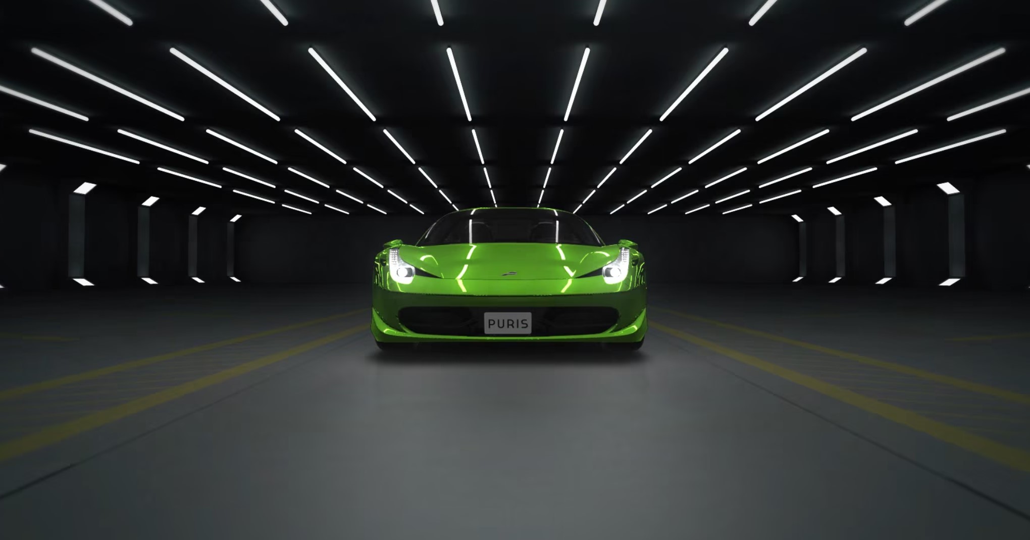
Motion Graphics
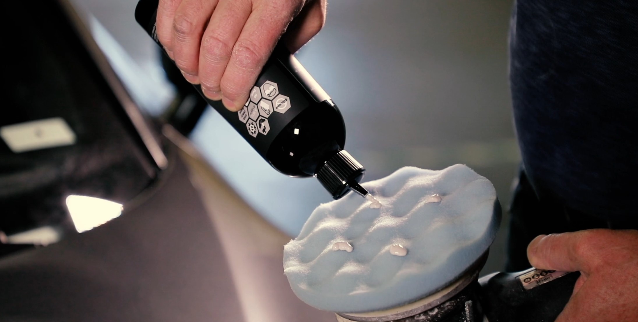
Video
Sound Design
Playlist
0:16
0:16
0:16
